Johnson Hospitality
Overview
Johnson Hospitality owns and operates hotels in Danville, California, in the San Ramon Valley. The brief was specific about tone: old-school professionalism, trustworthy and established, and explicitly not a tech-style logo.
Hotel management is a category that dresses uniformly, in navy, serif, and initials in a box. Standing out meant avoiding the obvious JH monogram without drifting into the modern, startup-adjacent territory the client had already ruled out.
We built the mark from the business itself rather than its initials: a hotel drawn in three-dimensional perspective, with the J and H set into its two visible faces. The exploration ran wide before it narrowed, taking in an alternate concept that placed the letters as buildings rising from the valley's hills, type studies in both serif and sans-serif, and a color pass that moved the identity from its original light blue to a deeper, more confident navy.
Services
- Logo Design
- Brand Identity
- Visual Identity
- Typography
- Art Direction
The full design exploration, from the first concept through the type studies and color work that settled it.
A Hotel, Not a Monogram
A hotel is a three-dimensional structure, so we drew one in perspective and set the J and H into its faces. The result is specific to Johnson Hospitality, taken from the properties actually in their portfolio.

The First Version
Version 1.0 in its original blue, set in Bitstream Charter, a 1980s face rooted in an 18th-century serif and chosen because it stays legible from business card to building signage. Alternate lockups accompanied the primary for tighter spaces.

A Sans-Serif Study
A Franklin Gothic variant, offered as a traditional-but-not-modern alternative. Drawn around 1900 and named for Benjamin Franklin, it is about as old-school American as a sans-serif gets.

Looking Past the Building
A second concept traded the single hotel for the place around it. Danville sits in the San Ramon Valley, so here the J and H rise from the hills as buildings in their own right.

Built on a Grid
Every structure in the valley concept was constructed on a three-dimensional isometric grid.

Finding the Navy
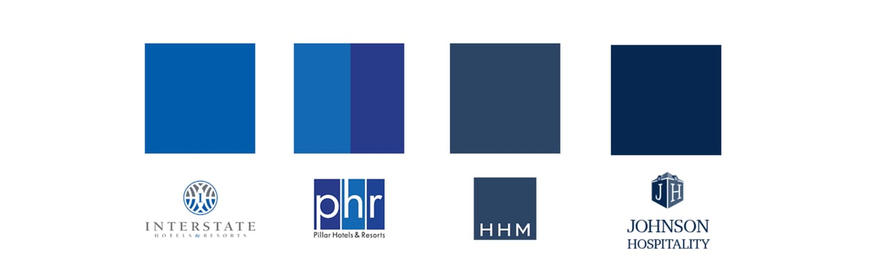
The client felt the original blue ran weak, and we agreed. The identity moved to PMS 540, a deeper and more confident navy, with a tint scale built in 25% steps.

Against the Field
Set beside Interstate, PHR, and HHM, the navy signals the category while the dimensional building mark is what separates Johnson Hospitality from it.
Results
Primary, horizontal, and compact lockups for every application
Type studies in both serif and sans-serif
Navy palette anchored on PMS 540 with a 25% tint scale