Invyncible
Identity, packaging and apparel for Invyncible, a wellness and supplement brand. One mark carrying a full supplement line through a category of lookalikes, and elastic enough to take the brand into lifestyle apparel.
Overview
Invyncible is a wellness and supplement brand. The identity had to carry a full product line on shelf and then keep going, into apparel and the lifestyle the brand wanted to stand for, without thinning out on the way.
Supplement branding tends to land in one of two clichés: clinical white minimalism or gym-floor bravado. Invyncible needed something that signaled vitality and growth without joining either camp, and a mark elastic enough to hold a packaging range together and still work worn.
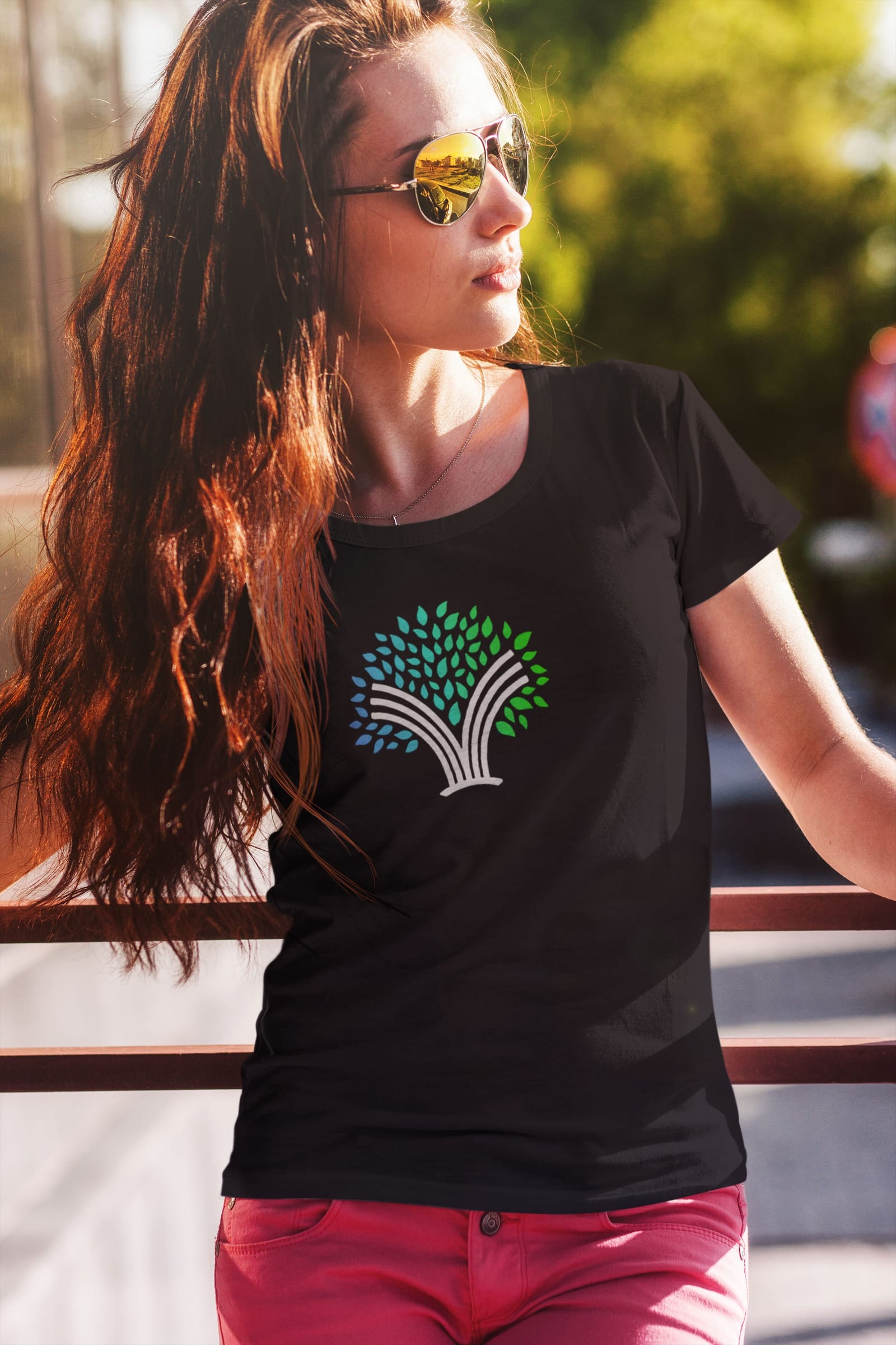
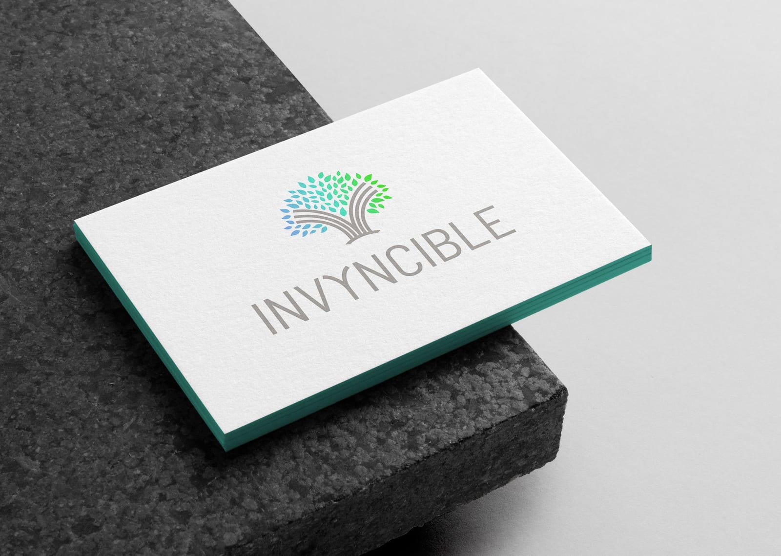
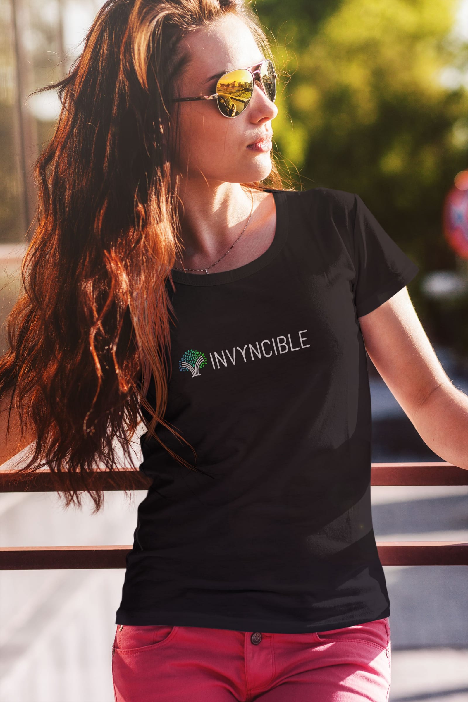
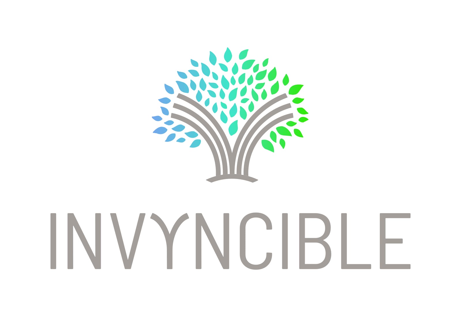
We built the identity around a tree, its leaves layered into a full canopy above rooted branches and its color running from blue through green. Growth and vitality, stated plainly. The mark carries the brand on its own, which lets apparel run the icon large and keep the wordmark quiet, while packaging pairs the two in a tighter lockup.
Services
- Brand Identity
- Logo Design
- Packaging
- Apparel Design
- Print Design
A single mark asked to hold a product range together and then carry the brand beyond it.
A Mark That Grows
Leaves layer into a canopy over rooted branches, shading from blue to green. It reads as a tree at a glance and as a system of individual parts up close, which is what lets the same mark hold together at every size the brand needs it.
On the Shelf
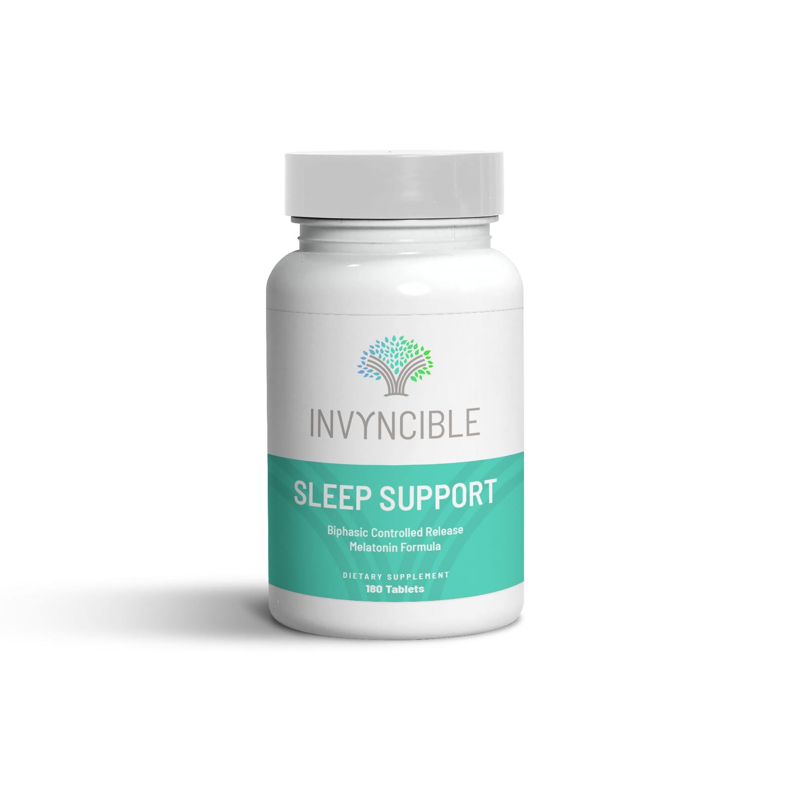
The system runs across the supplement line, here on a biphasic melatonin sleep formula, where the mark does the identifying work in a category of lookalikes.
Worn Loud, Labeled Quiet
On apparel the icon runs large and the wordmark stays small. The tree is distinctive enough to be worn on its own, which is what lets a supplement brand read as a lifestyle one.